Mauve: warm earth tones as an alternative to cool minimalism
Contemporary interiors are increasingly moving away from sterile, cool schemes toward a warmer, more welcoming aesthetic.
Mauve responds to this shift as a calm, deep shade that works well across furniture, door, and wall panel collections. See how earth tones from the Prime Collection can support the design of cohesive, modern products.
Biophilic Design: the role of calm earth tones in interiors
Growing interest in earth tones does not look like a temporary trend. It’s a response to the need for warmer, calmer, and more welcoming interiors. This direction is reflected in PANTONE 17-1230 Mocha Mousse, Pantone Color of the Year 2025 – a warm, muted brown with a soft coffee-and-cocoa character, close to the mood of Mauve.
This direction is supported by Biophilic Design – design inspired by a closer connection to nature – and by the growing importance of spatial psychology. In a world shaped by technology and sensory overload, users increasingly expect interiors to help them unwind. Muted reds such as Mauve, along with sunbaked rusts and oranges such as terracotta, work as grounding colors – shades that create a sense of stability. They warm up a space, organize the composition, and fit well with a 1970s-inspired aesthetic built around muted colors and soft, rounded forms.
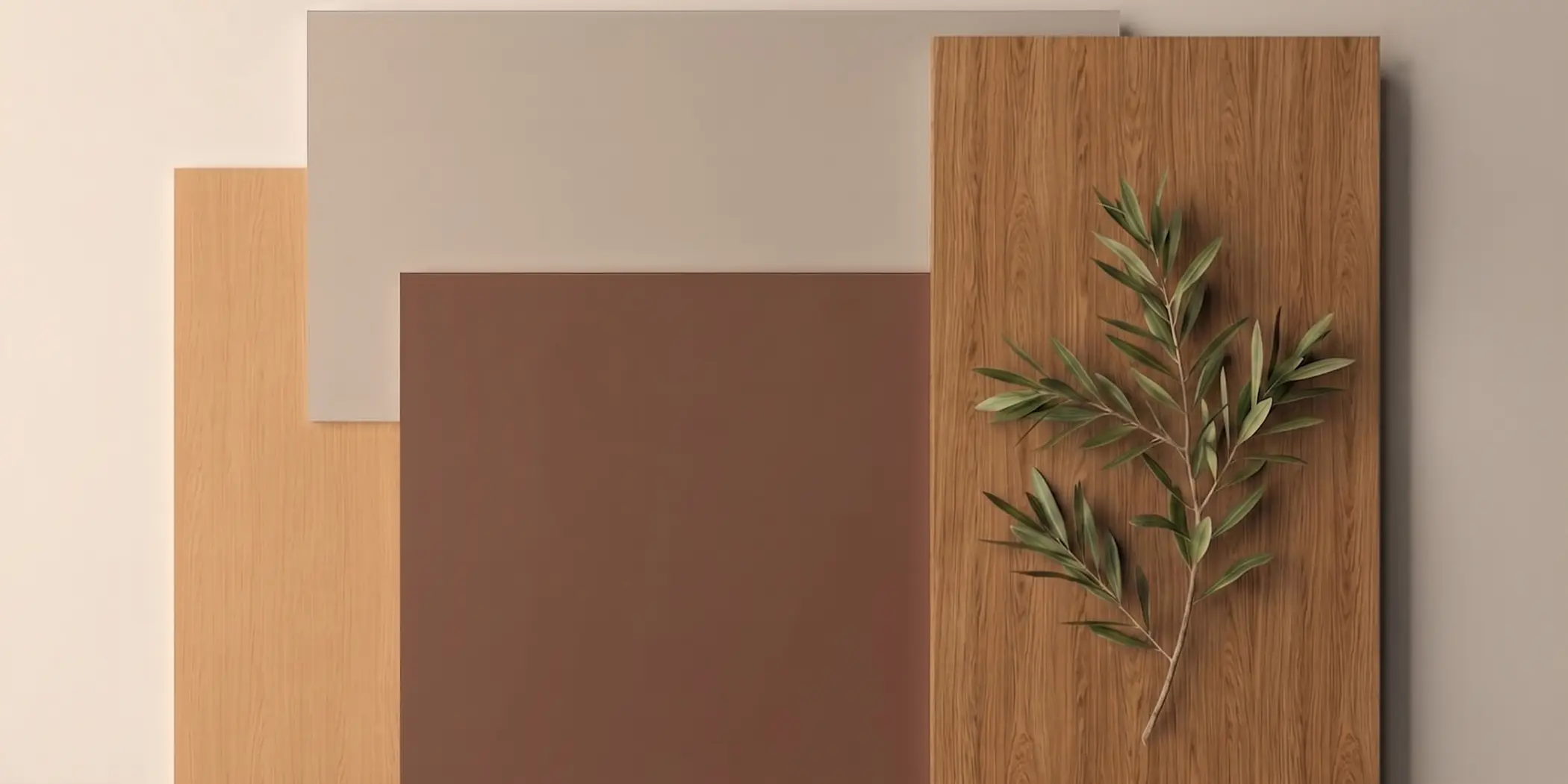
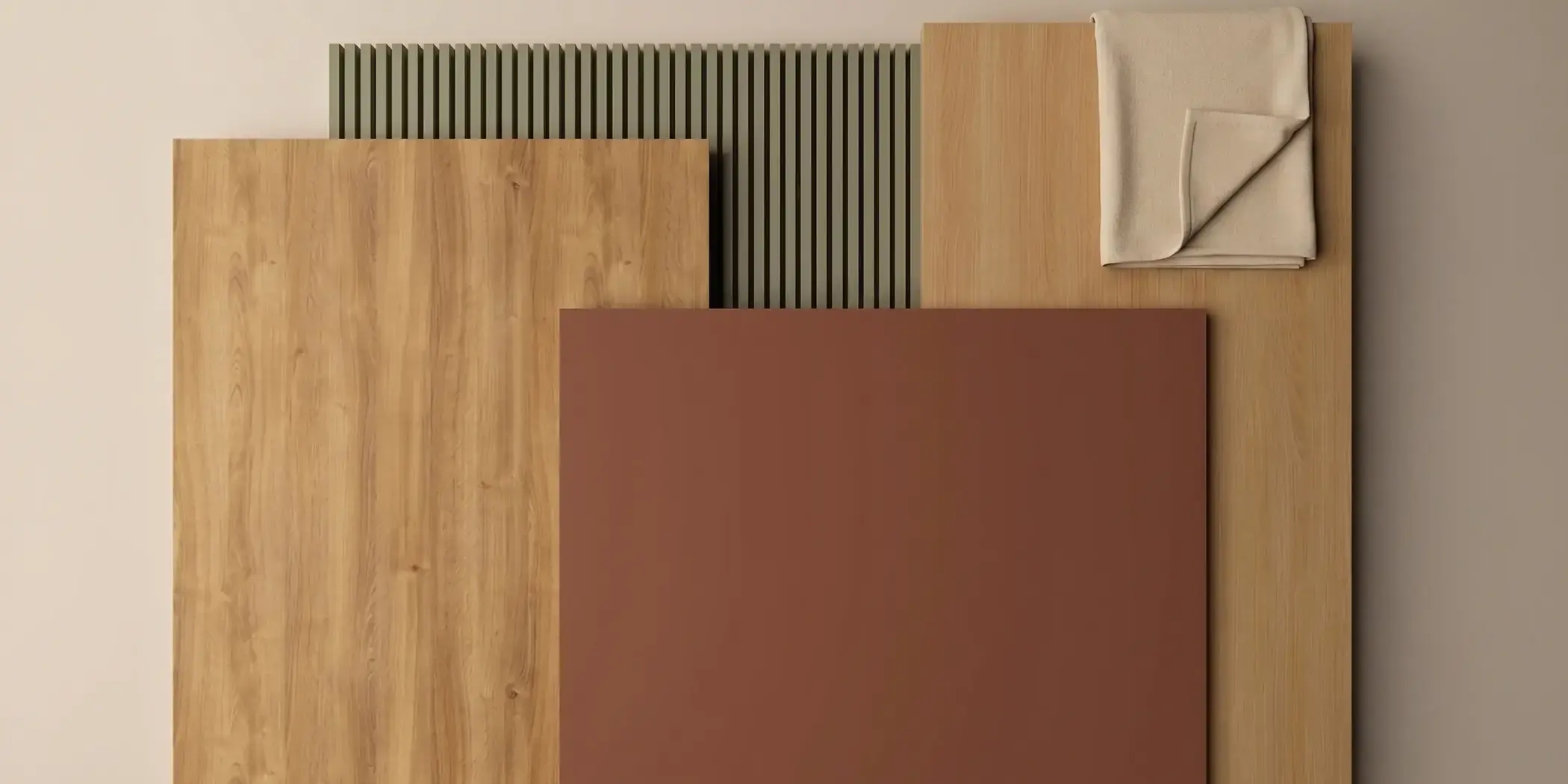
Mauve on large surfaces: a color that creates cohesion
Introducing earth tones requires a thoughtful approach to contrast, color temperature, and pattern scale. Mauve works well on flat furniture surfaces as well as on doors and wall applications. It gives forms a stronger character without overwhelming the space. It pairs naturally with cooler greens, like Pine Green, and natural oaks, such as Lindberg Oak or Karlstad Oak. This makes it a versatile choice for building cohesive combinations within a collection.

Natural combinations: wood, green, and a warm color base
In collections built around earth tones, it is important to balance color, structure, and material temperature. Mauve can act as a calm base that warms up the composition without competing with the wood grain.
Paired with natural oaks and muted green, it helps create interiors with a softer, more welcoming character. This direction works especially well in projects where cohesion, comfort, and modern simplicity are key.
Earth tones in transitional areas and commercial spaces
The right combination of earth tones helps build a sense of hospitality and understated elegance in both residential and commercial projects. Dark, earthy door panels and frames in Mauve set against warmer walnut wall cladding such as Nogal Mediterraneo or Columbia Walnut, and finished with brushed brass details, create a balanced, elegant effect.
