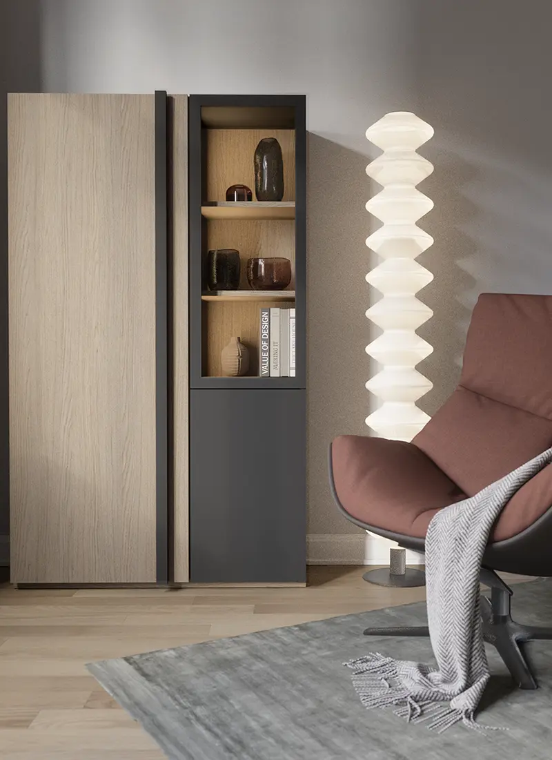
Arles Oak: A Calm Greige with Crafted Detailing
Recently, there has been growing interest in neutralcolors that don’t look “flat” – warm, calm shades that work across many interior concepts. A greige tone (a blend of grey and beige) meets these expectation sbecause it stabilizes a collection’s color palette and makes it easier to combine decors across a series of furniture and doors. Arles Oak (16-18085-104) adds a crafted detail (subtle cracks and fine pores), giving the surface anatural yet modern look.
Why are we returning to a neutral color palette?
In interior trends, a clear shift toward calmer palettes is becoming more visible – neutral, warm, and natural, but not rustic. In this context, greige is especially useful: it brings order to the color scheme and helps build collections that stand the test of time.
Crafted detail in a modern interpretation
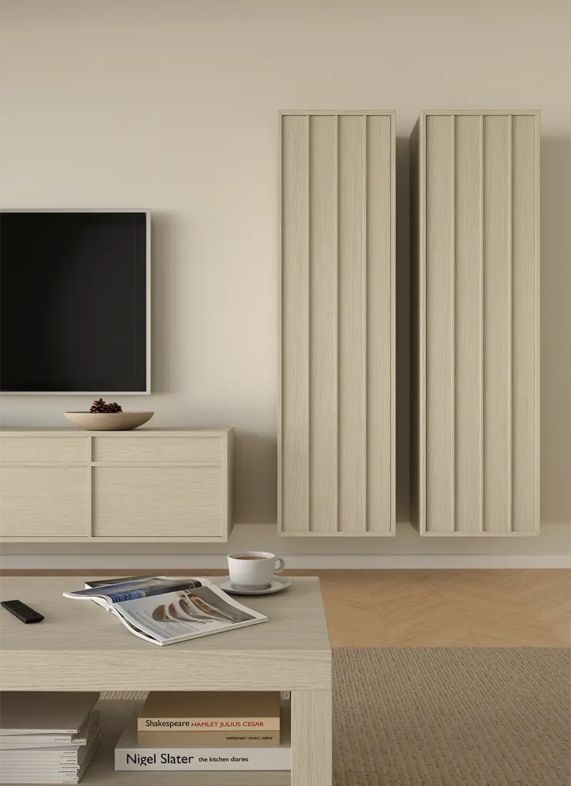
Arles Oak fits current trends thanks to its crafted detailing. Subtly cracked areas and refined pores introduce a natural look without heavy rusticity. This kind of detail works equally well on large panelsas well as narrower elements – the decor remains readable, but it doesn’t dominate.
Japandi, warm minimalism, quiet luxury – what do they have in common?
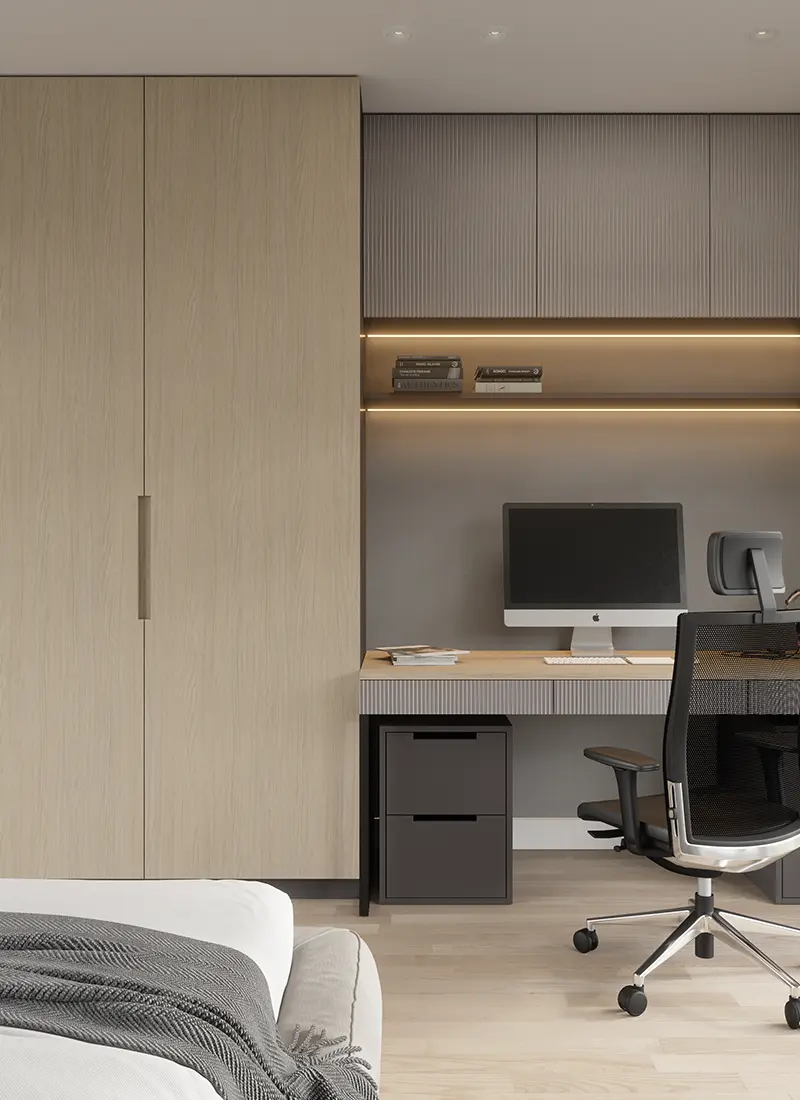
In a esthetics such as Japandi, warm minimalism, or quiet luxury, what matters is visual calm, natural materials, and thoughtful details. It’s not about a dramatic effect, but about a genuine material look, a soft interaction with light, and subtle differences in how the surface is perceived. That’s why Arles Oak works so well in the Smartfoil Nature finish, where the gradation of gloss levels enhances the veneered, natural character of the decor.
Where does Arles Oak work best?
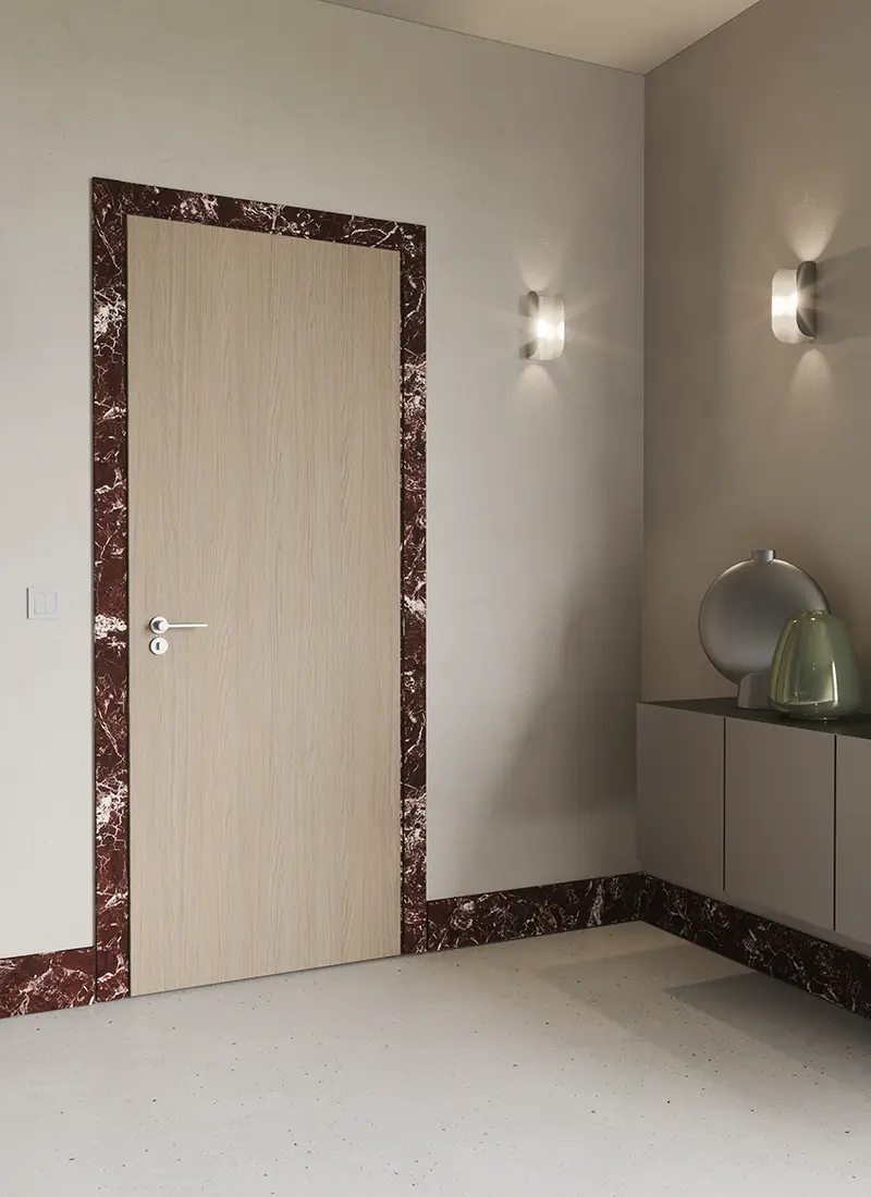
On large surfaces (fronts, panels), Arles Oak creates a calm background and brings order. On narrow elements (profiles, skirting boards, door frames), it acts as a refined detail. This decor was designed for consistency across different formats, making it easy to maintain a cohesive look for the entire piece.
In practice, this means simpler design decisions, because you can apply the same decor consistently across multiple components. Additionally, within the Prime Collection stock program, Arles Oakis also available in a warm tone: Arles Oak (16-18085-103).
How to use greige?
Greige is convenient for serial products because it combines the advantages of grey and beige without their extremes. It isn’t as cool as pure grey and doesn’t shift into yellow the way some beiges can. If you want to emphasize warmth, pair it with off-whites, sandy UNI colors, and soft textiles. When combining cooler solid-color decors and stones with a calm, restrained pattern, you’ll achieve a more minimalist, austere look.
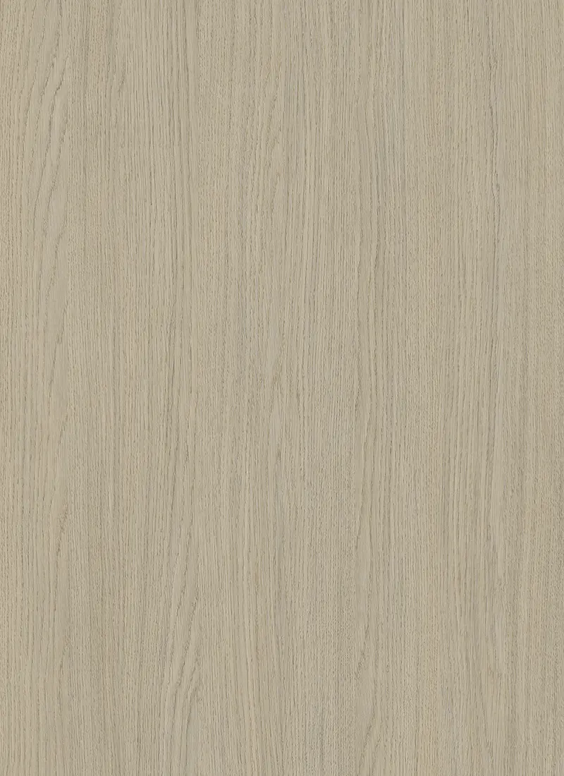

Arles Oak: a calm choice for years to come
Arles Oak is a crafted oak decor for calm, modern collections. Thanks to the versatile grain, it works well on fronts, doors, and profiles. The greige tone and the quiet wood pattern make Arles Oak a safe long-term choice – not just “for one season.” It is visually subdued and fits a wide range of interior styles, so the collection won’t lose relevance as trends change.