How To Design an Interior in Japandi Style: Definition, Origins, Color Palette, and Practical Tips
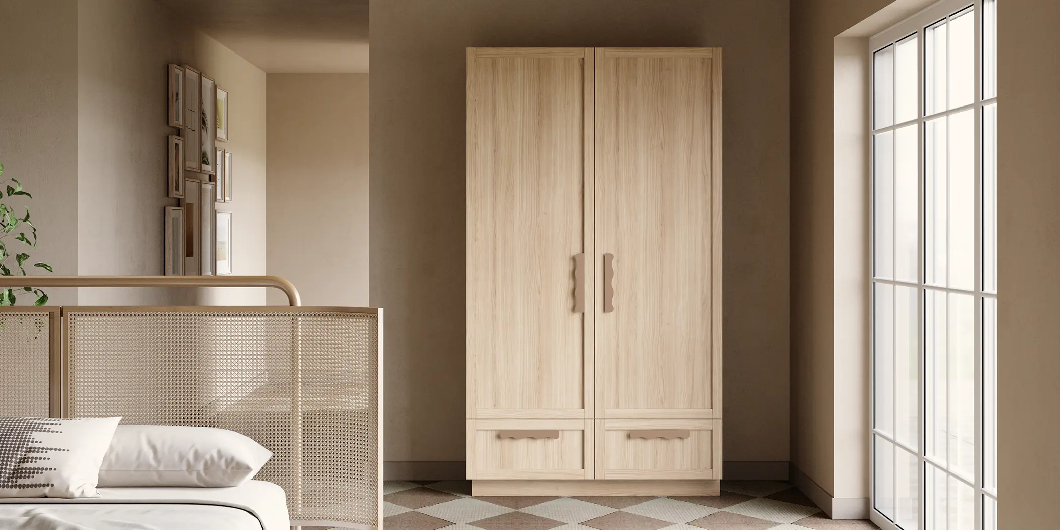
Japandi blends Japanese minimalism with Nordic simplicity. It’s an aesthetic of calm and order: form follows function, and materials and finishes take the lead. In its latest iteration, the style moves away from strict austerity toward details with a tangible texture – while still maintaining balance and restraint.
Origins and foundations: wabi-sabi meets hygge
At the heart of Japandi are two ideas: wabi-sabi (the beauty of imperfection) and hygge (a sense of coziness). Together, they createi nteriors that feel both clear and welcoming. That’s also why matte surfaces, open pores, and soft-touch finishes are chosen more often than glossy, ‘perfect’ surfaces.


Design principles: functional minimalism, zoning, and light
- Functional minimalism: fewer elements, but well-designed; concealed handles, clean divisions.
- Zoning: the home combines work and rest; light visual partitions help (i.e., slats).
- Light: lots of natural light; non-reflecting surfaces calm the composition and reduce eye strain
-
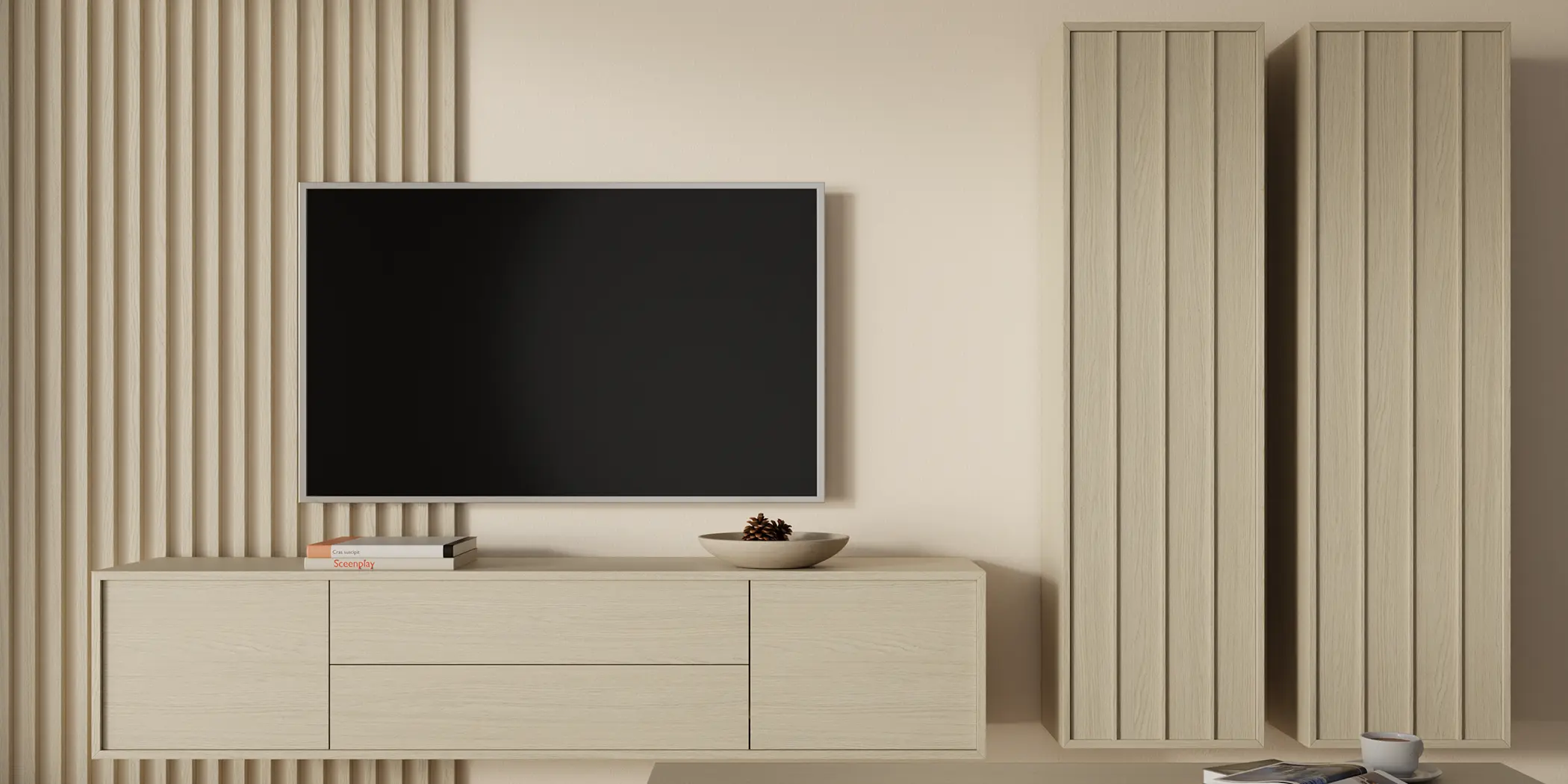
Color palette: beige, greige, and cashmere with warm wood
Contemporary Japandi is getting warmer. Alongside beige, greige, and cashmere tones, creams and earthy browns appear, while wood tones shift toward honey and walnut notes. Black or graphite act as a counterpoint: not just decoration, but a structuring element that sets rhythm and proportion. Harmony also comes from sage green and sandy shades.