Narrow format, big impact: decors for door frames, slats and more
Doors, door frames, slats, profiles, trims, and mirror frames may have a relatively small surface area, but they often have a strong impact on the overall look of a project. That is why choosing the right decor is not only about color, but also about the scale, direction, and the character of the pattern.
Why does decor scale matter?
A decor that looks good on a large front or panel may look different when applied to a narrow surface. Large knots, pronounced grain, or strong contrasts can make the pattern less legible on a narrow element.
Calm, linear, and homogeneous decors tend to retain their visual clarity more easily on smaller widths. More expressive decors can also work well, but in those cases, the way the decor is cropped becomes more important.
Practical tip: it is worth evaluating a decor on a sample that reflects the actual width of the product. This makes it easier to see how the wood grain works on a profile, door frame, or slat.
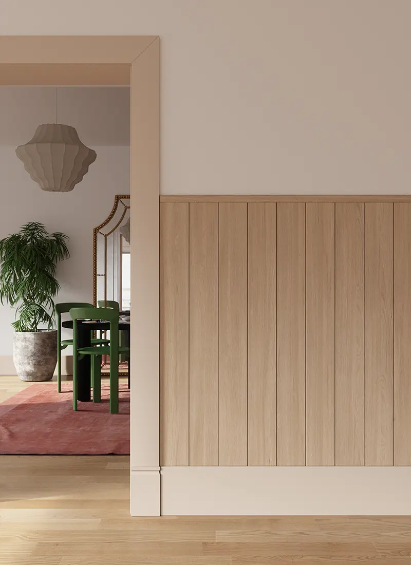
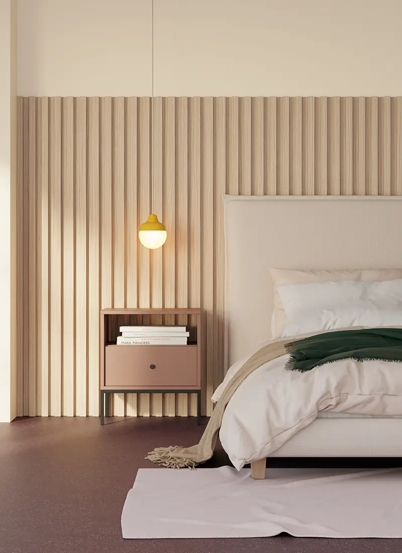
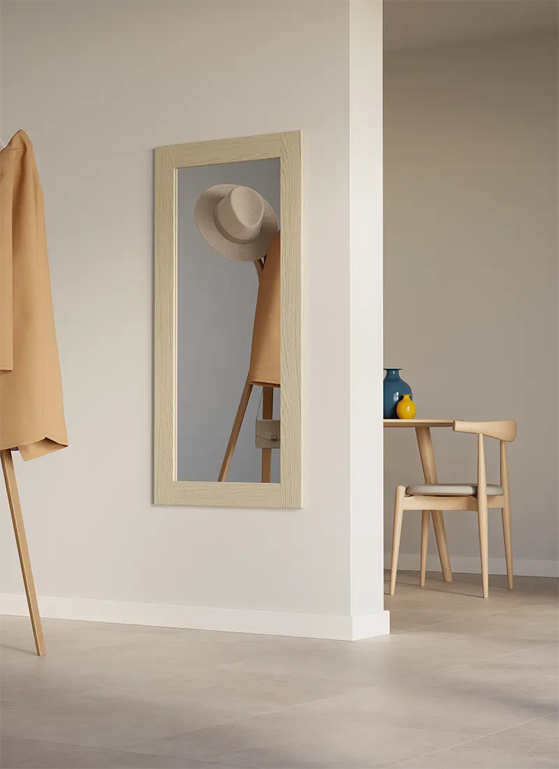
From left: Narbonne Oak paired with Uni Satin | Salvador Oak | Arles Oak
A calm decor at any scale
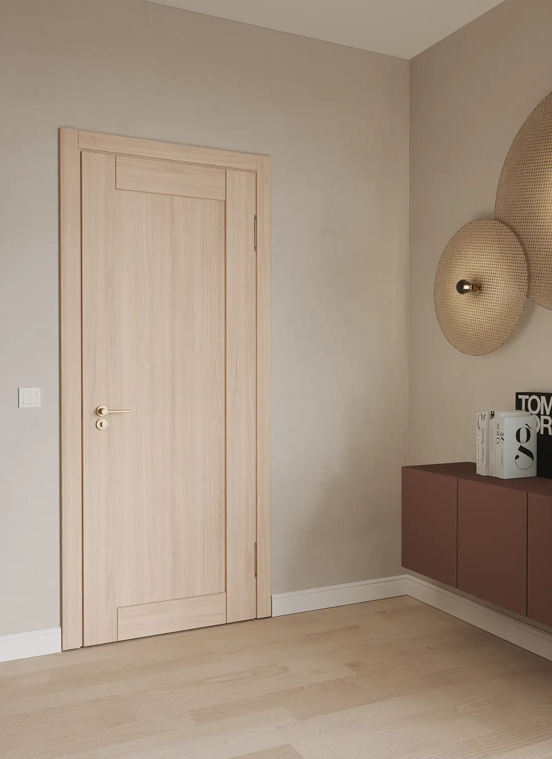
Salvador Oak, Narbonne Oak, and Arles Oak show three different approaches to a calm, natural wood look.
Salvador Oak – linear character across different formats
Salvador Oak stands out for its structured, linear pattern and uniform appearance. Subtle nuances in the grain add natural character without dominating the composition. This makes the decor suitable for both larger surfaces and narrower applications such as doors, door frames, profiles, or slats. Its calm appearance also makes it easier to create coordinated sets in which the same decor is used across several different elements.
Narbonne Oak – natural character on a smaller scale
Narbonne Oak combines calm linearity with small knots and subtle grain details. As a result, it retains the natural character of wood without being dominated by large, high-contrast features.
Arles Oak – a subtle detail in a greige tone
Arles Oak brings a calm greige color palette and a delicate, natural grain to this group. On narrow surfaces, it can act as a refined detail that complements larger areas rather than competing with them.
Satin and Stone Beige as complementary colors
Wood does not have to appear on every element within a project. Satin 16-203080-206 and Stone Beige 16-254065-319 can complement calm wood-look decors with a solid color while also emphasizing the geometry of the product.
Satin introduces a light, warm neutral tone, while Stone Beige creates a slightly deeper, more muted effect. Both shades can complement Salvador Oak, Narbonne Oak, and Arles Oak, creating calm and harmonious combinations.
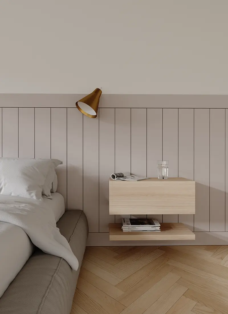
In practice, this can mean pairing wood-look doors with a solid-color door frame or combining a panel with a profile or trim in a UNI color. This approach helps maintain color consistency while still differentiating individual elements within the project.
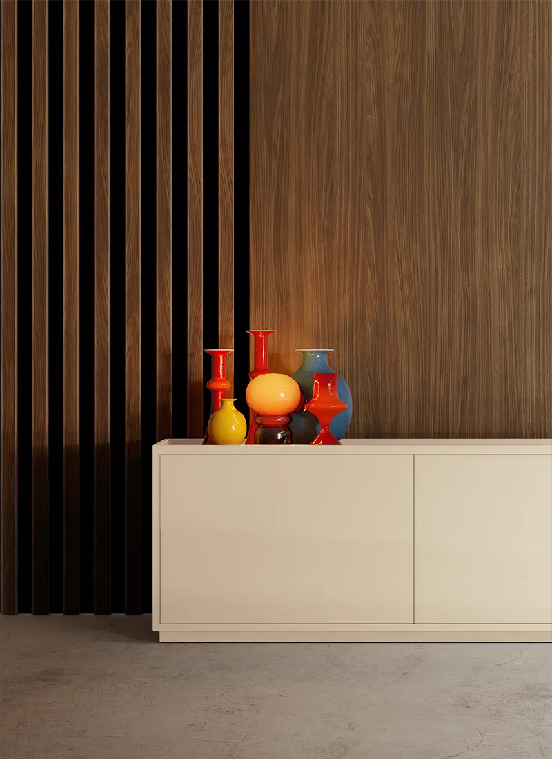
From left: Nogal Mediterraneo paired with Uni Ecru | Riva paired with Uni Cashmere | Riva
Using a narrow element as an accent
A narrow surface does not have to function only as a neutral detail. Slats, profiles, door frames, or frames can also act as decorative accents. In this case, it is worth choosing a more expressive grain or a deeper wood tone.
Riva – natural grain in the foreground
Riva works well in projects where wood is intended to be a visible part of the composition. Its more pronounced, natural grain can emphasize slats, narrow panels, decorative profiles, or mirror frames. For this type of application, scale becomes particularly important. It is worth checking which part of the pattern will remain visible on the finished element and whether it preserves the intended character of the decor.
Nogal Mediterraneo – the depth of darker wood
Nogal Mediterraneo combines a structured, linear grain with a darker color palette. This makes it possible to achieve a more expressive look without creating an overly rustic effect. On slim profiles or door frames, it can introduce depth and elegant contrast, especially when paired with lighter surfaces.
Ecru and Cashmere as a calm background
With more expressive wood decors, it can be useful to introduce light, calm UNI colors.
Ecru 16-151080-308 creates a very light, warm backdrop that helps highlight the natural grain of Riva or the deeper color of Nogal Mediterraneo.
Cashmere 16-90030-360 is a slightly richer warm neutral. It can soften contrast and create elegant combinations with darker or more decorative wood decors.
These combinations help maintain a balance between expressive wood grain and a calm background, without introducing another competing pattern.
One decor, many elements – how to build consistency
Narrow elements should be designed in the context of the entire product or collection. Doors, door frames, trims, slats, and panels often appear next to one another, so not only color coordination but pattern scale and direction are also important.
One option is to use the same decor across several components. Another is to combine a wood-look decor with a UNI color in a carefully selected tone and color temperature.
The same pattern may look different on a vertical slat, a horizontal trim, or a mirror frame. That is why it is worth evaluating the decor not only as a sample, but also in its actual format and alongside the elements it will be paired with.
Whether the choice is a calm pattern or a more expressive accent, consciously matching the pattern to the scale of the element helps create consistent collections and harmonious combinations.