Nordic Blue: a misty blue alternative to classic gray

Muted, misty blues are increasingly appearing in base color palettes for furniture design. Nordic Blue from the Prime Collection brings Scandinavian calm, lightness, and a well-balanced color direction into product design. See how to combine this subtle shade with light wood, linear grain, and cool details.

Matte surfaces and light: the calm dynamics of Nordic Blue

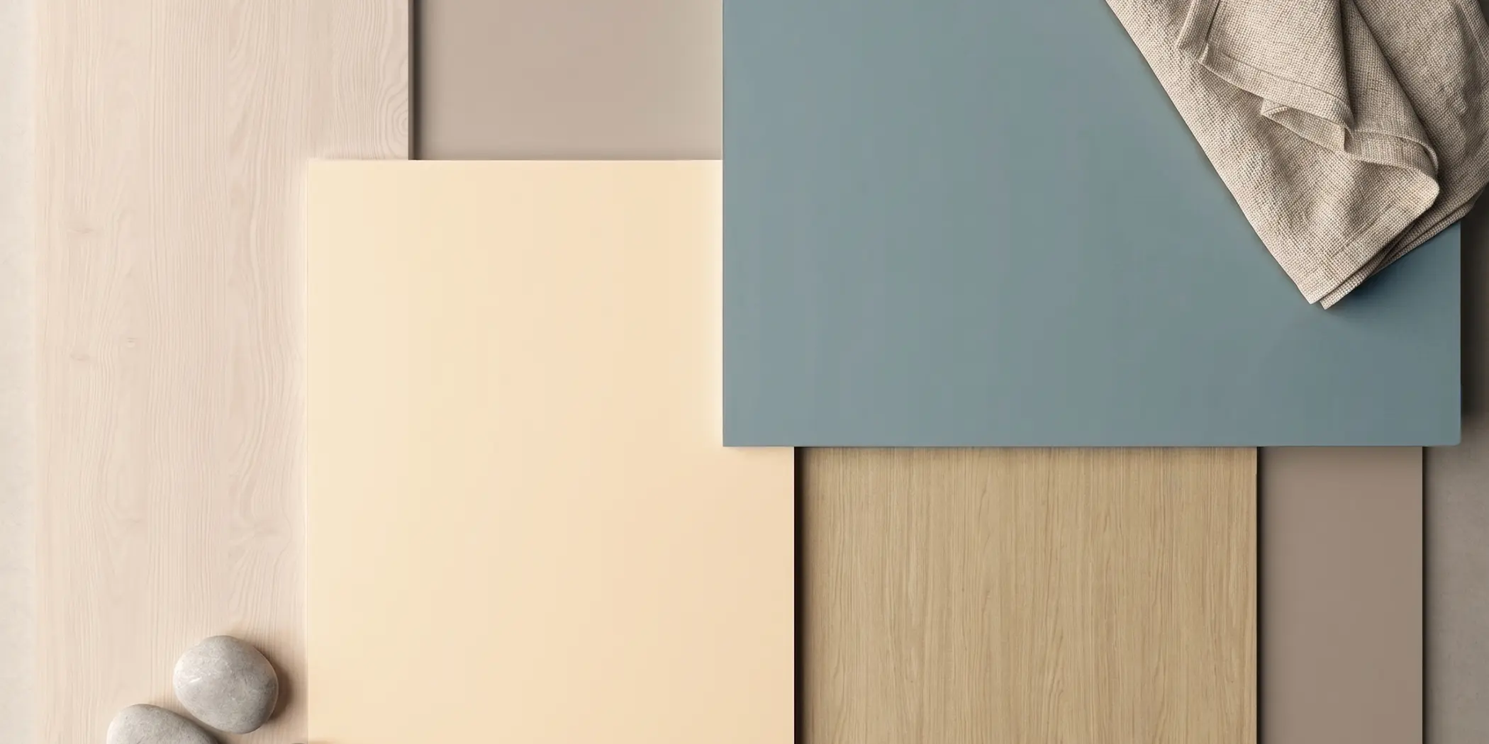
The growing interest in muted blues aligns well with the rise of light wood aesthetics. This is especially visible in combinations with decors such as Arles Oak and Sibiu Larch. A sandy-beige oak with a delicate linear structure and the softly white washed grain of larch both need a color that highlights their natural character without adding too much contrast.

Matte Nordic Blue works well with both structures. Its cool, misty tone balances the light nuances of the wood and helps create compositions with a clean, calm expression. It is a strong direction for projects based on soft minimalism – a gentler version of minimalism focused on simplicity, light, and material harmony.

A smooth base and linear wood: how to build rhythm in a design

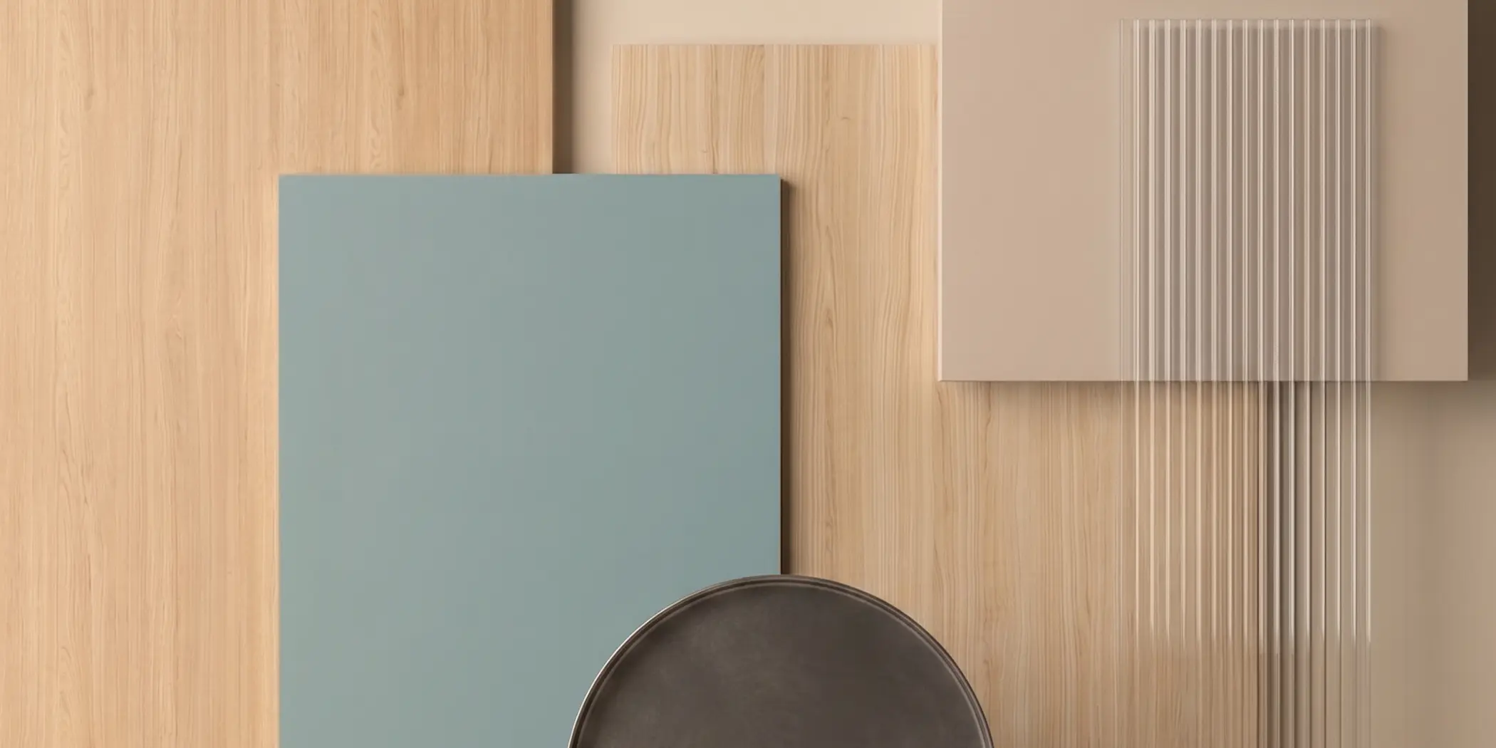
In modernfurniture systems, the relationship between a solid surface and a moreexpressive material structure is key. Nordic Blue works as a visualstabilizer in these combinations. On smooth fronts, especially handleless ones,it creates a calm frame for open niches, shelving, and display elementsfinished in light wood.

Combined with decors such as Riva or Narbonne Oak, it helps bring out the linear grain and gives the furniture a more organized look. This solution works well in collections that need to feel modern, yet still warm and inviting.
Precision and contrast: minimalism with a more refined character

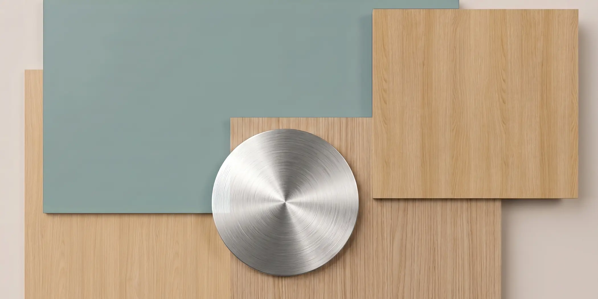
The potential of Nordic Blue is also clear in more complex, multi-material combinations. Pairing this misty blue with linear wood decors such as Salvador Oak, Blomberg Chestnut and Lindberg Oak, creates a composition that feels calm yet distinctive.

Cool accents in brushed aluminum or steel strengthen the technical character of the combination without taking away its elegance. This direction works well in offices, reception areas, and projects inspired by quiet luxury – understated, discreet luxury.
Nordic Blue: a misty blue alternative to classic gray

Muted, misty blues are increasingly appearing in base color palettes for furniture design. Nordic Blue from the Prime Collection brings Scandinavian calm, lightness, and a well-balanced color direction into product design. See how to combine this subtle shade with light wood, linear grain, and cool details.

A new take on neutrality: muted blue in collection design

Contemporary furniture design is increasingly looking for colors that can break away from classic grays without creating visual noise. Nordic Blue responds to this need as a shade that combines the restraint of northern landscapes with modern elegance.

As a solid-color UNI decor, it helps organize the composition and creates a strong starting point for calm, well-balanced combinations. It gives furniture forms a sense of lightness while emphasizing their architectural character.

Matte surfaces and light: the calm dynamics of Nordic Blue

The growing interest in muted blues aligns well with the rise of light wood aesthetics. This is especially visible in combinations with decors such as Arles Oak and Sibiu Larch. A sandy-beige oak with a delicate linear structure and the softly white washed grain of larch both need a color that highlights their natural character without adding too much contrast.

Matte Nordic Blue works well with both structures. Its cool, misty tone balances the light nuances of the wood and helps create compositions with a clean, calm expression. It is a strong direction for projects based on soft minimalism – a gentler version of minimalism focused on simplicity, light, and material harmony.

Sibiu Larch / Uni Ecru / Uni Silver Grey / Uni Nordic Blue / Arles Oak
The combination of Nordic Blue with light, linear Arles Oak and softly white washed Sibiu Larch creates a balanced, lightweight composition with a Scandinavian character.

A smooth base and linear wood: how to build rhythm in a design

In modernfurniture systems, the relationship between a solid surface and a moreexpressive material structure is key. Nordic Blue works as a visualstabilizer in these combinations. On smooth fronts, especially handleless ones,it creates a calm frame for open niches, shelving, and display elementsfinished in light wood.

Combined with decors such as Riva or Narbonne Oak, it helps bring out the linear grain and gives the furniture a more organized look. This solution works well in collections that need to feel modern, yet still warm and inviting.

Narbonne Oak / Uni Nordic Blue / Riva / Uni Cashmere
The contrast between the smooth Nordic Blue surface and the linear grain of lightwood gives the furniture form lightness, rhythm, and a modern character.

Precision and contrast: minimalism with a more refined character

The potential of Nordic Blue is also clear in more complex, multi-material combinations. Pairing this misty blue with linear wood decors such as Salvador Oak, Blomberg Chestnut and Lindberg Oak, creates a composition that feels calm yet distinctive.

Cool accents in brushed aluminum or steel strengthen the technical character of the combination without taking away its elegance. This direction works well in offices, reception areas, and projects inspired by quiet luxury – understated, discreet luxury.

Blomberg Chestnut / Uni Nordic Blue / Salvador Oak / Lindberg Oak
Nordic Blue combined with Blomberg Chestnut, Salvador Oak, and Lindberg Oak, finished with a brushed metal detail, creates a balanced contrast with a modern, elegant character.

Neutrality with more depth

Nordic Blue shows that neutrality does not have to mean giving up color. This misty blue makes it possible to build modern, calm collections that are easy to combine with light wood, metal, and other muted base colors.

How to use Nordic Blue in practice

  • An alternative to gray: use Nordic Blue as a calm color base in furniture and panel collections.
  • Light wood: pair it with Arles Oak, Sibiu Larch, Riva, or Narbonne Oak to create a light, Scandinavian effect.
  • Handleless fronts: use Nordic Blue on smooth surfaces that are meant to organize the furniture composition.
  • Office and reception areas: combine it with linear wood and brushed aluminum for a more technical, elegant look.
  • Children’s rooms and home offices: choose Nordic Blue where a calm color is needed, but white, beige, or gray feels too obvious.